Branding case study
Developing the brand of a global disruptor
The project
Working with digital agency Bespoke, I was brought in to analyse ten80’s existing brand, propose how best to address its short-comings and then develop improved branding that did justice to this fast-growing tech disruptor, enabling the client to appeal to global businesses and elite contractors.
ten80’s previous branding failed to reflect the professionalism of the company and the level of client they are targeting.
Objectives
The ten80 brand had a sound foundation, helping to communicate certain key messages and the nature of the business, albeit in a fairly generic way. However, the identity needed to be developed to deliver clarity and character with a more coherent and professional appearance.
The overly playful, chaotic feel needed to be replaced with branding that communicated trust, flexibility and high standards. A visual identity to reflect a dynamic business operating at a global scale, disrupting the standard client-contractor way of working and bringing greater value to both.
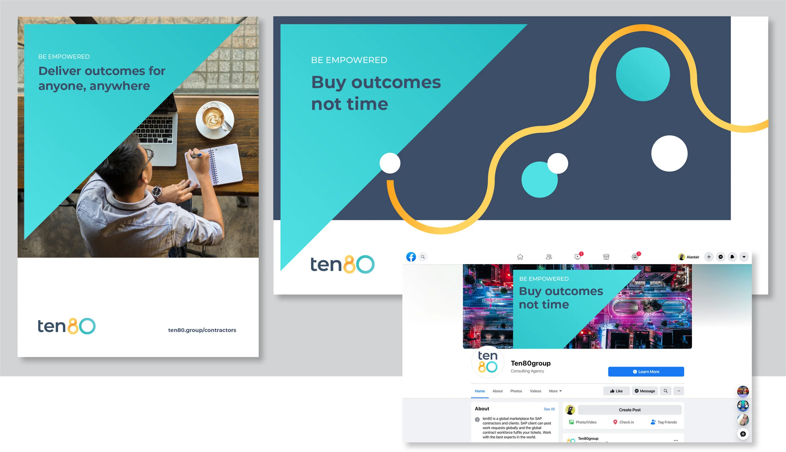
To achieve this, I redesigned the logo to make it more authoritative, developed a distinctive approach to photography and brand graphics, brought order to typography and improved the way colour was used to help give a more trusted feel while keeping a sense of flexibility and energy.
Curved and angled shapes seen in the inherited identity were further developed to improve their use and impact.
Flexible ‘pathway’ graphics were developed to connect and frame content, representing project journeys.
A distinctive library of aerial photography was sourced, communicating a sense of global scale to clients; and improved work-life balance to contractors.
The colour palette was clarified and extended to provide enough colours for charts within the client’s digital platform.
Outcomes
With the new branding approved, essential items were designed to support the next phase of the client’s growth, including: a new website, ROI calculator report, brand guidelines and a suite of templates.
The new branding gives the website and social media advertising real impact, helping to clearly communicate their value propositions to clients and contractors.
Clients are able to generate a personalised ROI calculator through the new website, demonstrating the cost-savings and value that ten80 can bring them.
The new branding has brought greater clarity, impact and stature to ten80’s marketing materials.
Like what you’ve seen?
This was a really swift and enjoyable project to work on alongside the team at Bespoke. Through clear and decisive thinking from all parties, everything was produced within 2 months, allowing the client to move forward with the next phase of their growth strategy.
Let me know your thoughts to this brand project, or get in touch if you’re interested in working together.


